Web design trends in 2026 that are worth taking seriously
Brutalist typography, dark mode, AI personalisation and performance: what brings conversions and what is passing fashion.
Web design trends in 2026 fall into two groups. One answers a real user need. The other just looks good in an award-winning portfolio.
At first glance they look equally modern, but one makes money and the other burns conversions. Here are the main directions: brutalist typography, scroll animations, dark mode, AI personalisation and performance. For each, when to use it and when to stay away.
Trend or passing fashion? A simple test
Before you jump on any trend, ask: does it make it easier for the visitor to do what they came for? If yes, it is a trend and worth your attention. If it only looks good in the designer's portfolio, it is a fashion, and in a few months it will look dated.
We build websites, and while trends change, the yardstick stays the same. Does it load fast? Is it clear within a few seconds what you offer?
Is the next step obvious? Whatever strengthens those three is a trend. Whatever weakens them is a fashion, no matter how many design blogs wrote about it.
Brutalist typography: character, not noise
Huge, raw, deliberately "irregular" lettering has by now become part of the mainstream. For good reason: a strong typographic hierarchy carries the message in seconds even without an image, and it immediately sets you apart from a sea of template sites.
If your competitors run identical, stock-photo, pale grey sites, a bold choice of typeface alone makes you memorable.
Where it goes wrong
Where does it go wrong? When the style becomes an end in itself: unreadable line lengths, text blocks piled on top of each other, headings that break apart on mobile.
Brutalist typography works when it stays a single strong gesture, such as one large heading and one characterful typeface, while the rest of the text stays comfortable to read. The aim is character, not noise.
Scroll animations: a strong tool in moderation
Scroll-driven animation is one of the most spectacular, and most often overused, tools of recent years. Used well, it gives the page rhythm: content appears when the visitor's attention reaches it, important messages stand out, and the page feels alive.
In practice, three rules are worth keeping:
- The animation serves the content, not the other way around. If the visitor has to wait to read the price, the animation does harm.
- One page, one or two spectacular moments. If every element floats, spins and fades, nothing gets emphasis.
- Less on mobile. On weaker devices too many animations cause stutter, and a stuttering page feels cheap. That is the opposite of what you want.
Dark mode: an increasingly common expectation
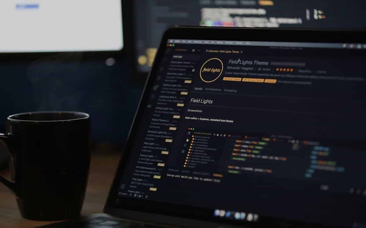
By 2026 dark mode is an increasingly common expectation. Many people set their phones to dark mode and find it more comfortable when a website follows the system setting.
An automatic theme that follows the system setting is no longer an extra. It is courtesy.
Two pitfalls
There are two pitfalls. First, dark mode is not just an inverted colour scheme. On a dark surface you have to rethink contrast, shadows and brand colours, or the page ends up unreadable or blindingly sharp.
Second, if your brand is built on a light, airy look, you do not have to produce a dark version at any cost. A consistent, readable light site is worth more than a half-finished dark theme.
AI personalisation: the real leap
While visual trends come and go, the biggest change is happening under the surface: websites increasingly do not show the same thing to everyone. AI-based personalisation adjusts content to the visitor's behaviour.
A returning prospect sees a different offer first than a first-time visitor, and someone arriving from an ad gets a page that matches the ad's message.
Personalisation at SMB scale
This is no longer a large-enterprise luxury. In a well-defined form it works at SMB scale too, typically at the level of the opening message, recommended products or newsletter content.
Here too the key is moderation: personalisation is good when the visitor feels served, not watched. Behaviour-based personalisation needs consent under GDPR and cookie rules. A badly tuned, pushy version destroys trust faster than any outdated design.
Performance as a design principle
The most important trend of 2026 is, paradoxically, invisible: speed. Search ranking, the return on ad spend and conversion all point the same way: a slow site is an expensive site.
So performance is no longer a late optimisation. It is a design decision: whether the page will be light or heavy is decided at the drawing board.
What it means in practice
What does that mean in practice? Fewer images, but better quality. Video only where it really works.
Two typefaces, not five. Animation where it directs attention, not everywhere. The result is typically not only a faster site but a better-looking one, because the constraint forces disciplined, clean design.
In our web development projects this is one of the first questions: what can we leave out so that the site gets stronger?
When a trend hurts conversion, and what to do instead
Here are the most common signs that a trend is no longer working for you but against you:
- Visitors spend strikingly little time on the site, even though the design became more "spectacular".
- The site is noticeably slower or stutters on mobile since the update.
- The click rate of the main button (enquiry, purchase) dropped after the redesign.
- Visitors do not reach the prices or the contact details because animations hold them up.
A better recipe
Good web design is not modern because it shows off every trend. It is modern because it knows exactly which ones to leave out.
The recipe is the same in 2026: one strong visual gesture, relentless speed, a clear message, and measurement. Introduce a trend only if you look at the numbers before and after, and withdraw whatever hurts conversion, no matter how fashionable it is.
Talk to us
If your site looks fine at first glance but does not bring enough, chances are it does not need more trends but fewer, in better places. In our design service we do exactly this: from the trends we take only what brings conversion in your market.
For orientation, a focused project starts from a few hundred thousand HUF. If you would like to know what would work on your site, write to us and we will look at it together.
FAQ
Do I have to adopt every 2026 web design trend to look modern?
No. Most sites need only one or two well-chosen directions, and trends work when they make the visitor's job easier. The goal is not to stack trends but to have a fast, clear, conversion-focused site.
Is dark mode mandatory in 2026?
It is not mandatory, but it is increasingly expected, especially on mobile. If you introduce it, it should not be a simple colour inversion: contrast, shadows and brand colours all need to be adapted to the dark surface. A well-made light site is worth more than a half-finished dark theme.
How do I know a design update hurt conversion?
From measurement. Compare the data before and after the update: time on page, click rate of the main button and mobile speed. If these get worse while the design looks more spectacular, the trend is working against you and it is worth rolling back.
How much does a website refresh along the 2026 trends cost?
It depends on scope and features, so we give an exact price only after discovery. For orientation, a focused project starts from a few hundred thousand HUF, and it is usually best to start with the highest-impact elements: speed, typography and the main message.
Related service
Design and brand identity
Brauniq designs logos, complete brand identity systems, UI/UX and web design, plus social media and ad creatives, all from one team.
Also related: Website development